A short interlude to explain a bit about how the art for A Book of Creatures is made. Like every artist, I’m my own worst critic and think my work is awful, but I do feel obliged to explain how I make the things that I believe could have been done so much better if only I’d used more ultramarine.
Most of the art in ABC is acrylics and pencil, with touchups on Photoshop. Some paintings (the Sinad, Dijiang, and all the Libyan snakes) were done in watercolor and pencil, for no real reason other than “it seemed like a good idea at the time”. The extent of Photoshop adjusting varies from 0 to extensive, depending on how much I hated the final result. To my eternal shame, I have not yet figured out how to paint on Photoshop, but I swear I will one day. Eventually…
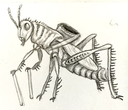
For my example, I will be following the creation of Haakapainiži, everyone’s favorite murderous anthropophagous eye-gouging grasshopper. Like all good paintings, Haakapainiži started out with a sketch, and before the sketch came the research. I knew Haakapainiži should be a grasshopper, but what kind of grasshopper? I love lubber grasshoppers, and their reduced wings, spikes, and poison seemed ideal for a ground-based menace like Haakapainiži.

Once the rough sketch is done, I start filling in details. This includes the basket, patterns, and textures. Probably because I’m used to painting animals, I don’t like to add lots of unnecessary detail for the sake of adding detail. This may or may not be a good thing. Spikes were an obvious addition, as were the little chevrons on the thighs. The stripes were added to give more of a predatory look.
I cannot stress how important it is to make a good underlying drawing. In my experience with acrylics, bad painting can be saved by good drawing, but no amount of good painting can save a bad drawing.
Now the fun starts. I usually use acrylics like watercolors, laying successive washes of increasingly dark colors, then picking out shadows and highlights. It was at this stage I decided to give Haakapainiži a colorful network pattern on his wings, like real lubbers have. It was also at this stage that I smudged paint on the paper. Fortunately, that’s what Photoshop erasing is for! And you thought thought an artist’s life was glamorous…

Light washes are followed up with darker ones, stronger colors. I decided to stick with a yellow palette in keeping with the desert theme, but actual lubber grasshoppers are really pretty and colorful. Don’t eat them.

Finally, I added shades of red in the eyes and around the body, and made the painting more three-dimensional by putting blue in the shadows and picking out highlights with undiluted white paint.
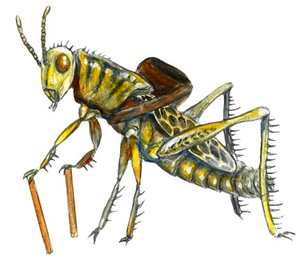
All that was left to do was erase everything that wasn’t Haakapainiži and do the usual entry format. For a change, I thought it was good enough that it didn’t need much adjusting in Photoshop besides tweaking levels.
And that’s how it’s done!
